

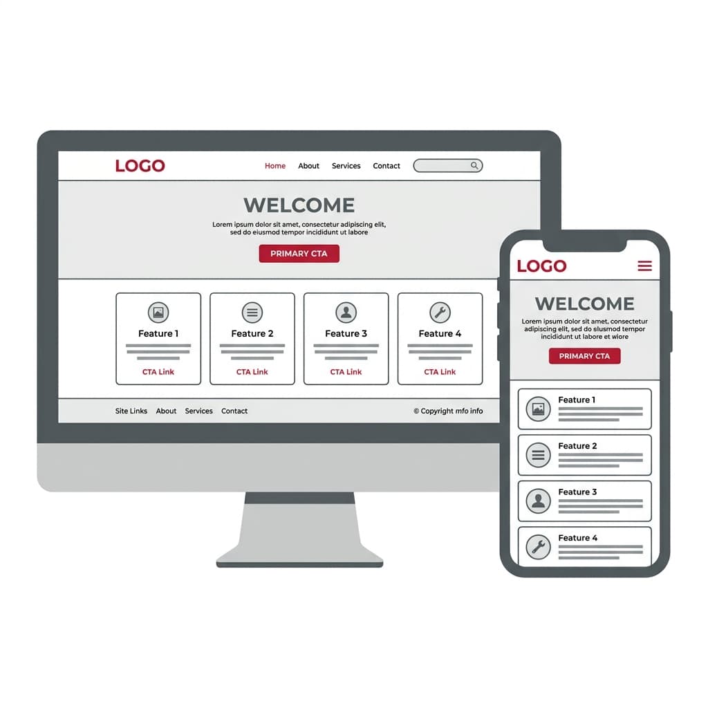
How to do web design is one of the most asked questions by business owners, developers, and designers. In 2026, professional web design is not only about creating visually appealing layouts but also about delivering responsive, SEO-friendly, and user-centered digital experiences. In this comprehensive guide, Kling Digital explains how to design a website from scratch, the tools you need, the principles to follow, and the mistakes to avoid. If you are wondering how to do web design, this article will walk you through every step with real-world examples.
What is Web Design?
Web design is the process of planning, conceptualizing, and building a website that is functional, aesthetically pleasing, and optimized for performance. It involves combining visual design (typography, colors, images, layout) with user experience principles, coding standards, and SEO practices. A good design ensures that users can navigate easily, find the information they need, and trust the brand behind the site.
Why Web Design Matters in 2026
Today, your website is your brand’s first impression. According to research, users decide within 0.05 seconds whether they like your site. If the design looks outdated, loads slowly, or fails on mobile devices, you lose credibility and conversions instantly. Here are the top reasons web design is critical:
- Brand Identity: A website reflects your brand’s professionalism and values.
- SEO Performance: Search engines reward websites with clean code, schema, and responsive layouts.
- Conversion Rates: A well-designed UX leads to higher sales, leads, and engagement.
- Mobile Usage: With 70%+ of traffic from mobile, responsive design is non-negotiable.
- Competitive Edge: In crowded markets, design quality often determines trust.
Key Principles of Modern Web Design
Before diving into the step-by-step process of how to do web design, it’s essential to understand the key principles that separate an average website from a great one:
- Visual Hierarchy: Arrange elements by importance (headings, CTAs, visuals).
- Responsive Design: Your site must adapt to mobile, tablet, and desktop screens.
- Performance Optimization: Minimize loading times with caching, image compression, and CDN.
- Accessibility: Ensure WCAG compliance (contrast, alt text, keyboard navigation).
- Consistency: Use a unified style guide (colors, fonts, spacing) across all pages.
- SEO-Friendly Structure: Semantic HTML, schema markup, clean URLs, and internal linking.
Web Design vs Web Development
Many beginners confuse web design with web development. While they are closely related, they focus on different aspects of creating a website. Understanding the distinction helps you plan better and hire the right professionals.
| Aspect | Web Design | Web Development |
|---|---|---|
| Focus | Look, feel, and user experience | Functionality, databases, and server-side logic |
| Tools | Figma, Photoshop, Canva, Sketch | HTML, CSS, JavaScript, PHP, React, Node.js |
| Output | Mockups, UI/UX wireframes, prototypes | Fully functional dynamic websites and apps |
| Skills | Typography, color theory, layout, UX | Coding, APIs, frameworks, databases |
In short, web design is about how a site looks and feels, while web development is about how it works. At Kling Digital, we combine both to deliver complete digital experiences.
How to Do Web Design in 7 Steps
Now that we’ve covered the principles, let’s dive into the exact process of how to do web design from start to finish. These seven steps will guide you whether you’re building your first portfolio site, a business website, or a large eCommerce platform.
Step 1: Define Your Goals and Target Audience
Every successful website starts with clear goals. Are you building for lead generation, eCommerce, branding, or information delivery? Define KPIs such as conversions, bounce rate, or sales. At the same time, identify your target audience: age, location, preferences, and digital habits. The design must align with both goals and users.
Step 2: Create a Wireframe and Sitemap
Before visual design, plan the structure. Use tools like Figma, Adobe XD, or Sketch to create wireframes. Build a sitemap that maps all pages and user flows. This ensures logical navigation and prevents confusion later. At Kling Digital, we always start with a wireframe workshop with clients.
Step 3: Choose the Right Platform (WordPress vs Custom)
Choosing a platform depends on project scale:
| Platform | Best For | Pros | Cons |
|---|---|---|---|
| WordPress | SMBs, blogs, portfolios | Easy to use, SEO plugins, huge community | Can get bloated without optimization |
| Custom Development | Enterprise, SaaS, complex systems | Full flexibility, high performance, scalability | Higher cost, longer development time |
| Website Builders (Wix, Squarespace) | Personal sites, small businesses | No-code, quick setup, templates | Limited SEO and scalability |
Tip: For most businesses, a properly optimized WordPress site strikes the right balance between flexibility and cost. Kling Digital specializes in both WordPress and custom solutions, depending on your needs.
Step 4: Design the Visual Identity
Colors, fonts, and imagery make or break a website. Follow brand guidelines and modern design trends, but always prioritize readability and UX. Use no more than 2–3 font families, and keep a consistent color palette. Tools like Coolors or Adobe Color can help you create harmonious palettes.
Step 5: Develop Responsive Layouts
Responsive design ensures your site looks good on every device. Use CSS frameworks like TailwindCSS or Bootstrap, or design with clamp() font sizes and fluid grids. Google rewards mobile-friendly sites with better rankings, making responsiveness a must.
Step 6: Optimize for SEO & Performance
A beautiful design is useless if nobody finds it. Optimize your site with:
- Semantic HTML (h1–h6 structure, alt tags, meta tags)
- Schema markup (Article, FAQ, Product, Service)
- Image compression (WebP, AVIF)
- Lazy loading & caching
- Fast hosting (preferably with CDN)
At Kling Digital, we integrate SEO and performance optimization from day one, not as an afterthought.
Step 7: Test, Launch, and Maintain
Before launch, test usability, responsiveness, SEO, and accessibility. Use tools like Google Lighthouse, GTmetrix, and Wave Accessibility Checker. After launch, continuously monitor analytics, update plugins/themes, and publish new content to keep your site fresh and ranking.
Remember: Web design is not a one-time task—it’s an ongoing process. Regular updates and optimizations ensure long-term success.
Web Design Platforms Compared
When learning how to do web design, one of the most common questions is: should you use WordPress, a custom-coded site, or a website builder? Here’s a comparison table to help you decide.
| Platform | Best For | Ease of Use | SEO Potential | Scalability |
|---|---|---|---|---|
| WordPress | Small to medium businesses, blogs, eCommerce | Beginner-friendly, plugins available | Excellent with RankMath/Yoast | Moderate (requires optimization) |
| Custom Development | Enterprises, SaaS, high-performance apps | Requires coding knowledge | Full control with technical SEO | High (scales with infrastructure) |
| Website Builders (Wix, Squarespace) | Personal sites, quick launches | Very easy (drag-and-drop) | Limited | Low |
WordPress vs Custom Web Design
Choosing between WordPress and custom web design depends on your project’s scale, budget, and growth potential. Here’s a quick breakdown:
- WordPress: Ideal for businesses that need flexibility, SEO features, and quick deployment. Perfect for content-driven websites and eCommerce.
- Custom Development: Best for enterprises that require unique functionality, advanced integrations, or extremely high performance. Comes with higher costs and longer development cycles.
Verdict: For most companies, WordPress is the smarter starting point. But if your project demands scalability and unique features, custom is the way to go. At Kling Digital, we build both—so you’re not locked into one choice.
Figma vs Adobe XD for Web Design
Designers often ask whether to use Figma or Adobe XD when prototyping. Both are industry leaders, but they shine in different areas:
| Tool | Strengths | Limitations | Best For |
|---|---|---|---|
| Figma | Cloud-based, real-time collaboration, cross-platform | Internet required for full features | Teams, agencies, remote collaboration |
| Adobe XD | Offline use, integrates with Adobe suite | Limited collaboration compared to Figma | Solo designers, Adobe ecosystem users |
If collaboration is key, Figma wins. If you’re already in the Adobe ecosystem, XD may fit better. Kling Digital uses Figma for most client projects due to its speed and teamwork features.
SEO-First vs Design-First Approach
Another common debate is whether web design should prioritize SEO or aesthetics. Here’s the truth:
- SEO-First: Ensures your site ranks, drives traffic, and performs technically well (speed, schema, mobile-friendly).
- Design-First: Focuses on visual appeal, branding, and creativity—but may ignore performance and accessibility.
The best web design balances both. At Kling Digital, we design for humans and optimize for search engines, creating websites that rank and convert.
Frequently Asked Questions (FAQ)
Here are the most common questions about how to do web design, answered by Kling Digital’s expert team:
1. What skills are required for web design?
Modern web design requires a mix of UX/UI design, HTML/CSS, JavaScript, responsive layout skills, and a basic understanding of SEO.
2. Can I do web design without coding?
Yes. Tools like WordPress, Webflow, and Wix allow you to build websites visually. However, learning some HTML/CSS gives you more control and flexibility.
3. How long does it take to design a website?
It depends on the complexity. A simple website may take 1–2 weeks, while a custom enterprise solution may take 2–3 months or longer.
4. Which is better: WordPress or custom web design?
WordPress is better for most businesses due to flexibility and plugins. Custom design is better for enterprise-level projects requiring unique features.
5. How much does web design cost?
Costs vary. A basic site can start at $500–$1000, while advanced custom websites may cost $5,000–$20,000+. At Kling Digital, we provide tailored quotes.
6. What is responsive web design?
Responsive design ensures your website looks and works well on all devices—desktop, tablet, and mobile. It is a must for SEO and user experience.
7. How do I make a website SEO-friendly?
Use clean code, optimize images, apply schema markup, use proper heading structure, and install SEO plugins like RankMath.
8. Is web design the same as web development?
No. Web design focuses on visuals and user experience, while web development handles functionality and coding.
9. Do I need hosting for web design?
Yes. A hosting provider stores your website files and makes them accessible online. For WordPress, a reliable host is essential.
10. Why choose Kling Digital for web design?
At Kling Digital, we combine SEO-first design, modern development, and user-focused creativity. We build websites that rank, perform, and convert.
Conclusion
Learning how to do web design is a journey of combining design, development, and SEO. Whether you start with WordPress or a custom build, the key is balancing creativity with performance. Always design with users in mind, and don’t forget SEO from day one.
Ready to take your website to the next level? Contact Kling Digital today—we design, develop, and optimize websites that grow your business.
2026 Web Design Engineering Standards: Design Systems, Core Web Vitals, and Accessibility
In 2026, executing professional web design extends far beyond static visual aesthetics; it requires rigorous frontend engineering that drives high conversion rates while remaining effortlessly parseable by search engine crawlers and generative AI answer engines. Building a resilient, enterprise-grade digital presence demands adherence to four foundational technical pillars:
1. Atomic Design Systems and CSS Design Tokens
As a digital platform scales across dozens of landing pages and locales, maintaining visual consistency requires moving from ad-hoc page templates to an Atomic Design System. Color palettes, typographic scales, spacing increments, and border radii should be architected in Figma as Design Tokens and mapped directly to CSS custom properties (--color-primary, --radius-card, --font-sans). Instead of rigid breakpoint jumps, modern layouts utilize CSS clamp() functions for fluid typography and spacing that scale mathematically across every viewport width.
2. Core Web Vitals and Strict Performance Budgets
Telemetry confirms that even a 100-millisecond delay in page rendering measurably degrades user trust and conversion rates. Every visual decision made during the UI/UX phase must be governed by an explicit Performance Budget:
| Performance & UX Metric | 2026 Engineering Threshold | UI/UX & Frontend Implementation Standard |
|---|---|---|
| LCP (Largest Contentful Paint) | < 2.5 seconds | Serve above-the-fold hero assets in next-gen AVIF/WebP formats, apply fetchpriority="high", and eliminate render-blocking CSS/JS resources. |
| INP (Interaction to Next Paint) | < 200 milliseconds | Avoid heavy main-thread JavaScript animation libraries; rely on hardware-accelerated CSS transitions and Server Components to keep input latency near zero. |
| CLS (Cumulative Layout Shift) | < 0.1 | Reserve explicit width, height, or aspect-ratio dimensions for all media containers and dynamic embeds, and preload self-hosted variable web fonts. |
3. WCAG 2.2 AA Accessibility and Inclusive Ergonomics
Web accessibility is both a legal requirement in major global markets and a direct multiplier on organic search performance and conversion rate optimization (CRO). An inclusive interface ensures frictionless navigation for all users:
- Contrast Ratios: Maintain a minimum contrast ratio of 4.5:1 for body copy and 3:1 for large headlines and interactive UI components.
- Keyboard & Focus Navigation: Every navigation drawer, modal dialog, and multi-step form must be 100% operable via keyboard (Tab, Enter, Escape) with unmistakable focus-visible outlines.
- Mobile Touch Targets: Design all interactive buttons and links with a minimum hit area of 44x44 pixels to eliminate tap errors on mobile viewports.
4. Semantic DOM Hierarchy and Schema.org Graph Architecture
For search engines and AI systems to extract and cite your content accurately, your visual hierarchy must mirror a clean semantic HTML DOM tree. Enforce a single H1 tag per URL followed by logically nested H2 and H3 subheadings, utilizing native elements (nav, main, article, section, aside) rather than generic div wrappers. Finally, embed a unified JSON-LD (@graph) payload connecting Organization, WebSite, Service, BreadcrumbList, and FAQPage entities to maximize rich snippet eligibility.