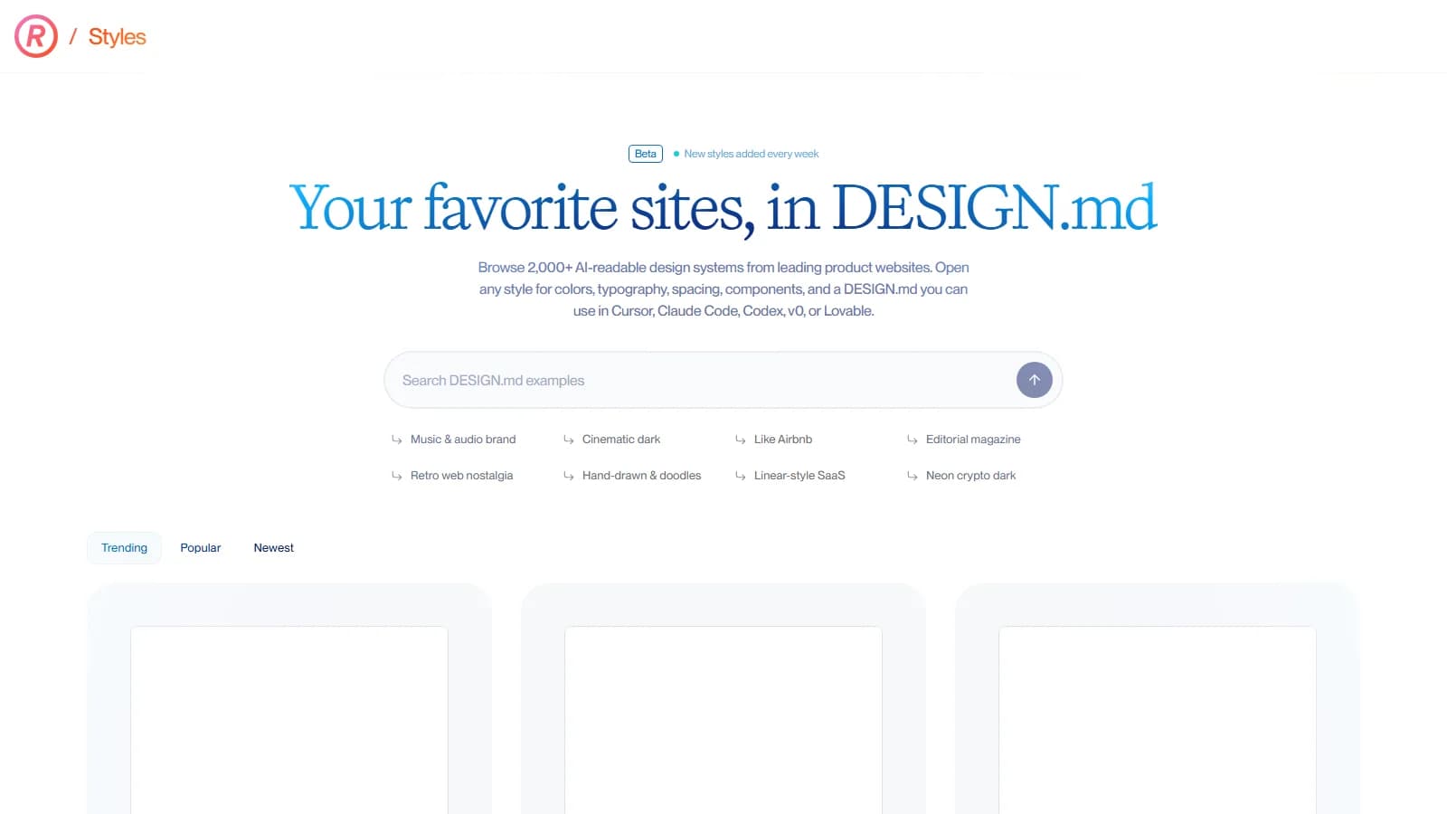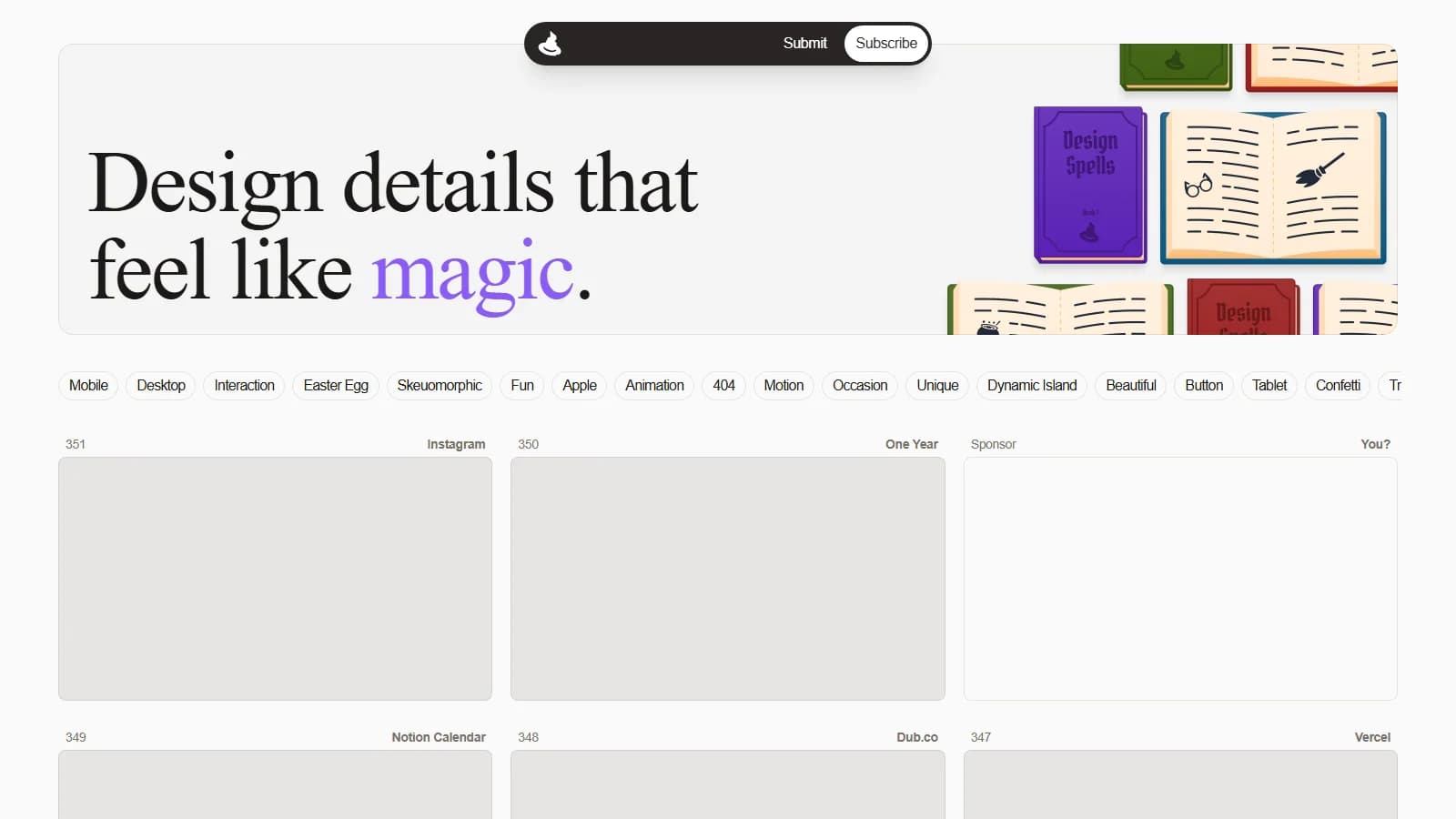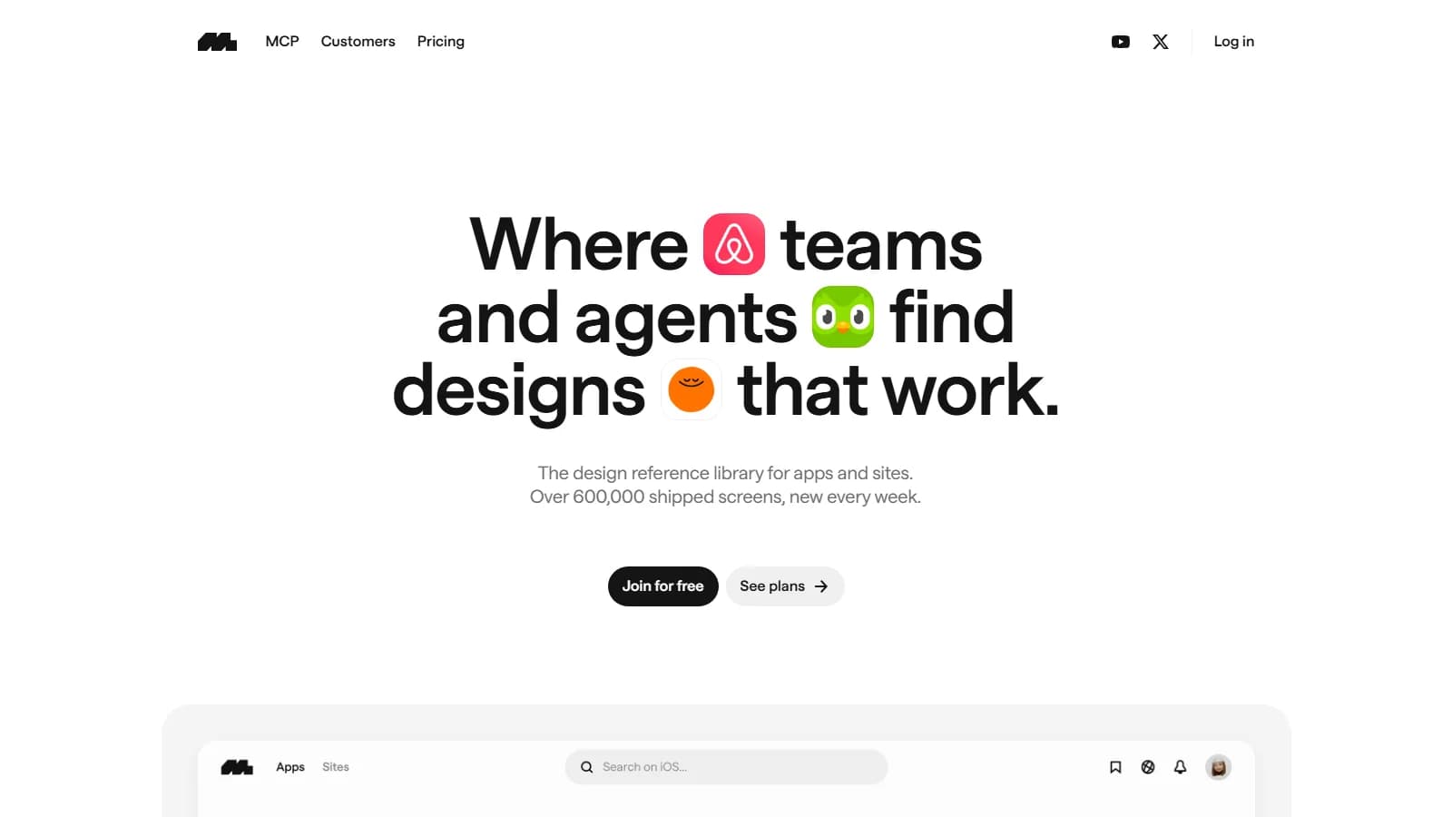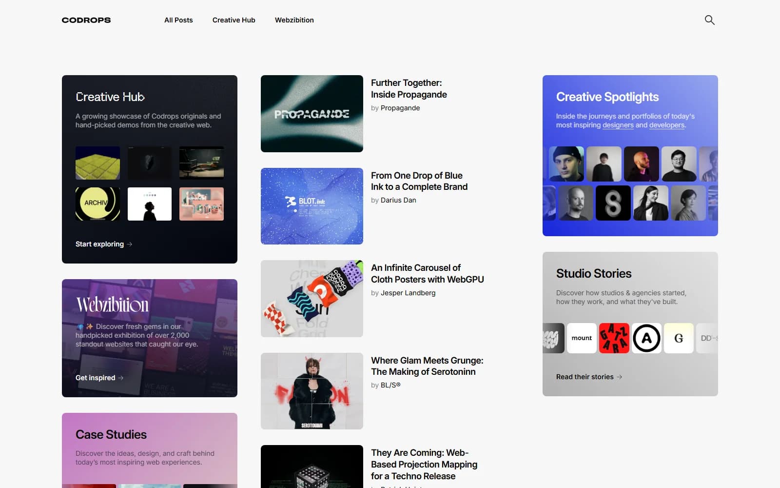
Dark Mode Design curates exceptional dark-themed web experiences across modern software, creative studios, and luxury storefronts. The platform solves a persistent creative challenge: crafting deep background palettes without muddy grayscale tones or harsh stark contrasts. Designers explore finished real-world products to master subtle borders, elevated surfaces, and balanced visual hierarchies effortlessly.
Key Highlights
This free public archive gathers leading dark interfaces in one streamlined space. Instead of sifting through mixed visual clutter, creative directors inspect live productions showcasing proper contrast balance, textured charcoal layers, and focused neon accents. It accelerates moodboarding while demonstrating how top brands handle night-friendly aesthetics with poise.
Real-World Use Cases and Creative Problems Solved
Constructing dark digital spaces requires nuanced visual control. Pure black backdrops often trigger optical fatigue when paired with bright white typography, while uncalibrated gray shades blur structural hierarchy. Design teams frequently struggle to establish consistent elevation, readable body text, and restrained highlight glows. This curated showcase solves these craft hurdles by highlighting working examples where art directors resolve contrast ratios, subtle outlines, and depth with poise.
- Product Design Leads: Examine multi-tiered card elevations and subtle border strokes to structure complex dashboards without overwhelming users in low-light environments.
- Brand Identity Designers: Gather real benchmark sites to convince clients that dark colorways convey luxury, technological excellence, and focused sophistication.
- Independent Web Creators: Discover inventive hero treatments, typographic layouts, and neon focal points that elevate creative portfolios above conventional light themes.
- Early Startup Founders: Identify successful visual directions for software launch pages quickly, reducing design exploration cycles while maintaining an upscale aesthetic.
Design Experience, Creative Workflow, and Practical Advantages
Navigating this gallery offers immediate visual gratification. High-resolution desktop previews present authentic layouts without intrusive watermarks or distracting promo banners. Unlike generic design portals that blend every aesthetic together, this collection maintains strict editorial focus exclusively on nocturnal interface excellence. Creators can swiftly scan dozens of curated submissions across fintech, artificial intelligence, hardware, and agency sites. Clicking any preview immediately routes visitors to the live production website, letting designers inspect interactive behaviors, scroll dynamics, typography scale, and subtle button states directly in their browser.
Studying how accomplished studios structure dark layouts provides actionable lessons for brand teams building high-impact platforms. When evolving digital products from concept to launch, integrating tailored digital design services ensures your dark palette maintains legibility across diverse screens while highlighting primary calls to action. Once your interface aesthetic reaches completion, assessing technical health through an intuitive web address search analyzer keeps your live web presence discoverable and search ready. This balanced creative process blends artistic surface styling with reliable web visibility from the very beginning.
| Evaluation Criterion | Traditional or Fragmented Workflow | Platform Studio Approach |
|---|---|---|
| Finding functional dark interface depth and contrast benchmarks | Sorting through disorganized boards featuring flat mockups that overlook true contrast needs | Examining live websites showing calibrated charcoal layers, subtle outlines, and balanced text hierarchies |
| Evaluating real interactive behaviors and subtle hover states directly | Reviewing static screenshots that conceal how hover states and glowing elements behave | Following direct external links to test genuine interactive choreography on live storefronts |
| Efficiency during creative moodboard assembly for dark themes | Wasting billable hours filtering unrelated light interfaces across unfocused visual inspiration archives | Browsing a dedicated nocturnal showcase where every entry adheres strictly to dark aesthetics |
| Navigating platform access requirements and unexpected hidden subscription paywalls | Encountering mandatory user signups, gated browsing sessions, or costly monthly library subscriptions | Enjoying unrestricted free visual exploration with zero account creation or payment gates required |
Who Should Use It and Where Are the Limits?
This directory thrives as a creative discovery asset for digital designers, brand strategists, and tech founders preparing to launch sleek products. However, teams should understand its deliberate boundaries. The gallery spotlights top-level marketing homepages and studio folios rather than complex internal software dashboards or authenticated account screens. Furthermore, because it curates live external creations, showcased sites may occasionally refresh their styling or change their web address. It also lacks granular color-hex filtering or downloadable component assets, making it an inspiring aesthetic benchmark rather than a turnkey design system.
Kling Digital Editorial Note
When exploring dark interfaces for client work, Kling Digital recommends extracting tonal values directly through browser color pickers instead of guessing hex codes. Inspect the contrast between charcoal background layers and off-white heading typography to verify accessible readability before translating those visual styling choices into your own production design files.