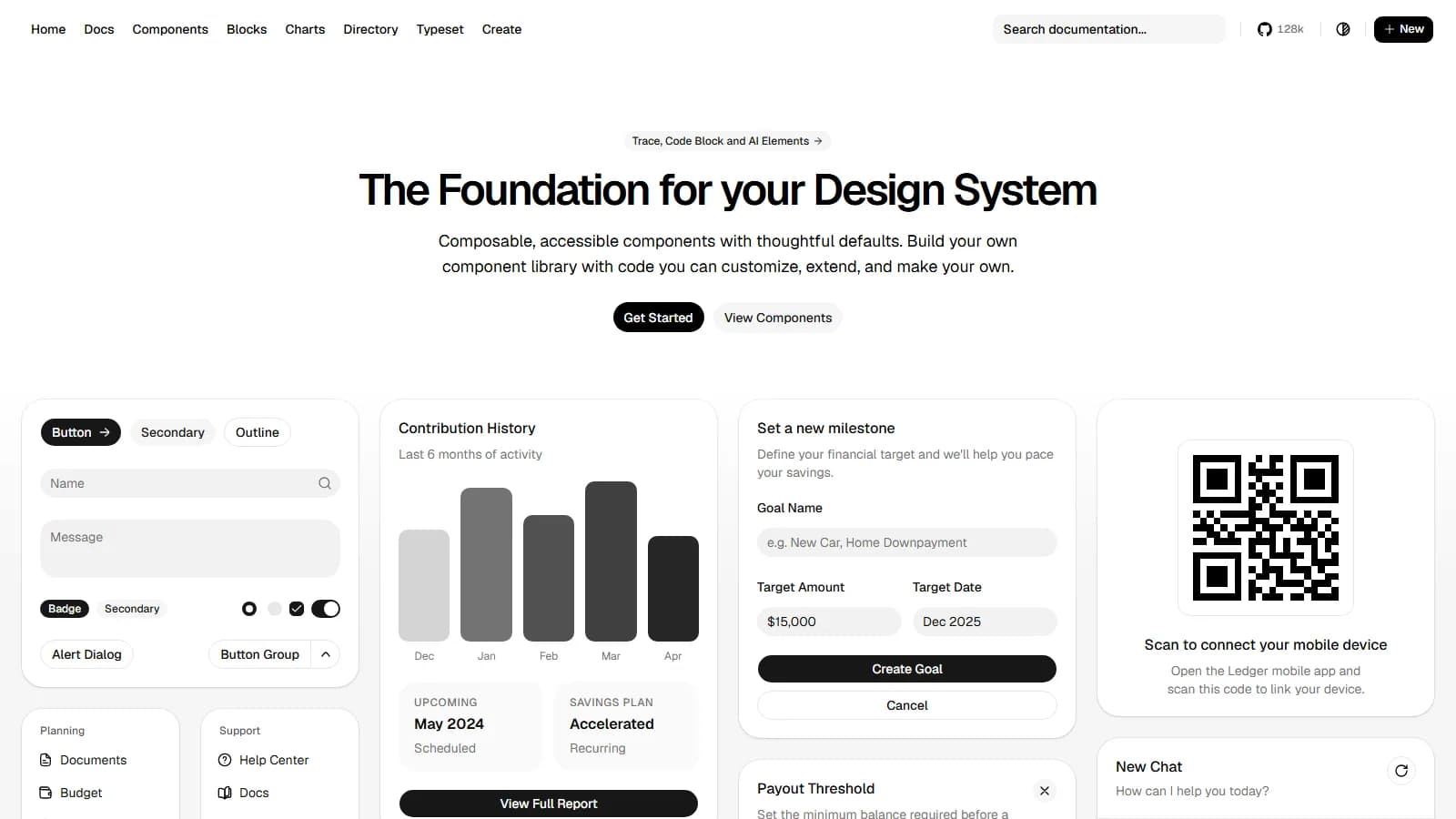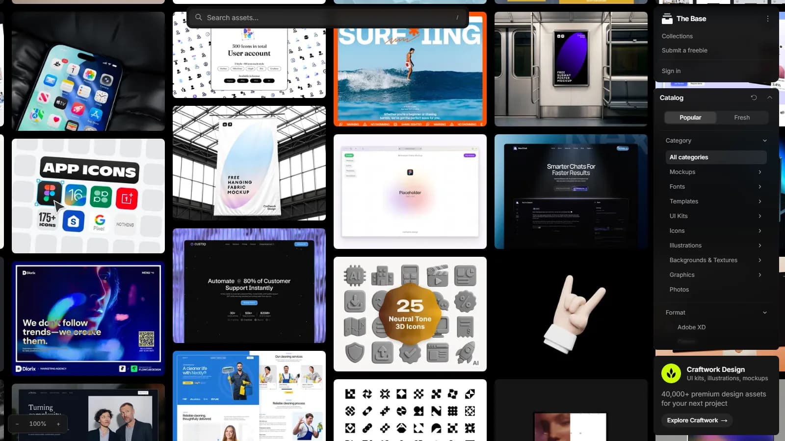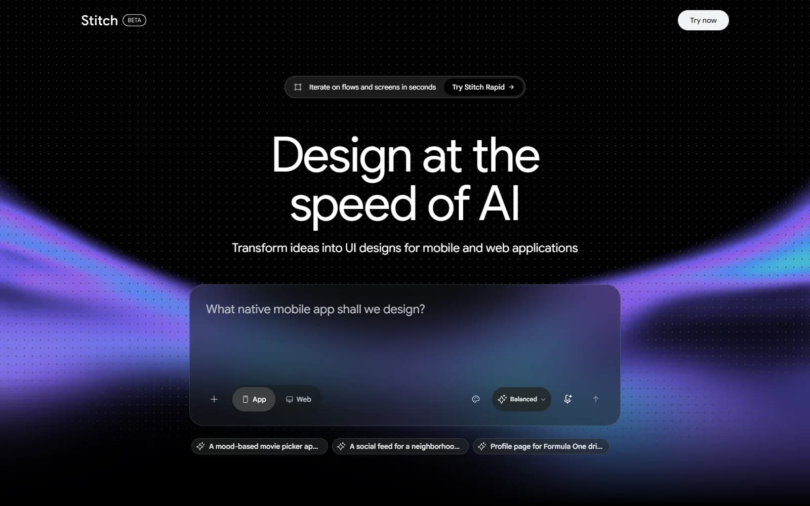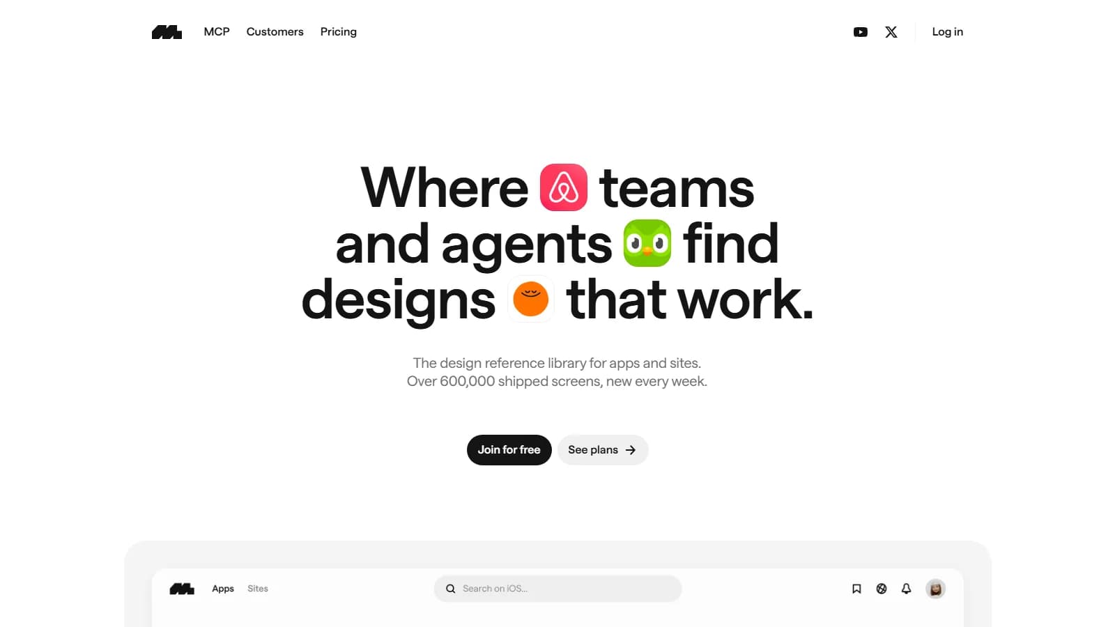
Material Design 3 provides digital creators with an expansive design system that bridges intentional aesthetic expression and functional usability. Built around dynamic color extraction, flexible typography, and evolving component states, this open design framework helps creative studios build accessible, coherent touchscreens and web interfaces without assembling basic interface rules entirely from scratch.
Key Highlights
This system pairs deep accessibility research with rich expressive features, including automated contrast calculation, organic shape morphing, and fluid layout guidance. Creative leads gain instant access to production-ready design assets, cross-platform UI kits, and tonal color algorithms that elevate interface quality while respecting critical user legibility benchmarks across diverse modern screens.
Real-World Use Cases and Creative Problems Solved
Digital product designers frequently wrestle with inconsistent component sizing, chaotic color contrasts, and fragmented handoff materials when moving concepts across mobile and web layouts. Material Design 3 resolves these friction points by supplying mathematically balanced color tones, structured layout grids, and interactive touch specifications. Teams spend far less time debating baseline button paddings or state transitions, directing their creative energy instead toward brand storytelling and distinct customer journeys.
- Brand Identity Designers: Derive complete accessible light and dark interface palettes instantly from a single core brand hue without guessing color contrast ratios.
- Lead Product Designers: Accelerate wireframing and interactive prototypes using prebuilt Figma UI libraries packed with rich adaptive navigation and responsive container layouts.
- Multiplatform Creative Directors: Maintain coherent visual rhythm between mobile touchscreens and desktop viewports using standardized type scales, responsive elevation, and organic shape tokens.
- Early Stage Tech Founders: Launch polished consumer MVPs with complete design integrity on tight schedules while entirely eliminating upfront interface asset licensing fees.
Design Experience, Creative Workflow, and Practical Advantages
Designing with Material Design 3 feels like working alongside a mature aesthetic laboratory. Rather than dictating rigid monochrome blocks, the framework introduces expressive shapes, variable typographic scales, and dynamic color science that adapts intuitively to user preference or core brand seeds. Creative leads can seamlessly adjust corner curves, elevation levels, and motion curves through dedicated visual tooling. This setup bridges the historic divide between playful creative identity and disciplined usability, giving digital products tactile warmth without sacrificing essential visual clarity.
When organizations embark on building custom interfaces, adopting these foundational guidelines accelerates layout iteration substantially. Creative studios frequently integrate these component patterns alongside our bespoke design system services to craft distinctive visual expressions tailored to unique audience expectations. Meanwhile, keeping interactive components lean ensures responsive rendering across devices, which teams can verify using our interactive website speed tester for optimal performance. By leaning on battle-tested button states, floating toolbars, and adaptive navigation rails, your team ensures that aesthetic ambition translates smoothly into usable production screens.
| Evaluation Criterion | Traditional or Fragmented Workflow | Platform Studio Approach |
|---|---|---|
| Color Palette Generation | Designers manually pick hex values, risking inaccessible contrast ratios across dark mode variations. | Algorithmic dynamic color generates harmonious, contrast-safe tonal palettes directly from a seed color. |
| Cross-Platform Layout Consistency | Teams maintain disparate asset files for each platform, causing visual drift over time. | Standardized adaptive layouts, navigation rails, and shared typographic scales unify web and mobile. |
| Component States and Motion | Crafting custom hover, press, focus, and elevation states consumes excessive design hours. | Predefined expressive states, fluid physics tokens, and shape morphing work out of the box. |
| Accessibility Standards Integration | Accessibility reviews occur late in product cycles, triggering costly layout revisions and redesigns. | Rigorous touch targets, contrast math, and readability guidelines are integrated into every asset. |
Who Should Use It and Where Are the Limits?
Material Design 3 thrives in product ecosystems prioritizing cross-platform coherence, robust accessibility, and agile interface building, from healthcare portals to expansive software dashboards. However, teams must understand its creative boundaries. The default aesthetic carries recognizable styling cues that can make consumer brands look like native utilities unless designers deliberately customize typography, elevation, and corner shapes. Furthermore, tiny single-page promotional sites rarely require this level of complex component logic, and Apple-focused consumer apps usually demand additional styling adjustments to feel right alongside standard iOS interface patterns.
Kling Digital Editorial Note
At Kling Digital, we recommend treating Material Design 3 as an architectural chassis rather than an off-the-shelf skin. By injecting unique brand typography, custom spacing tokens, and bespoke illustration styles into its structured color logic, your studio achieves enterprise-level usability while preserving an unforgettable, authentic creative identity.